The homepage is one of the most challenging pages to design for an online store. What should you prioritize? What images should you show to attract customers to stay on your site and explore? How do you make a great first impression? Let’s start by understanding the purpose of the homepage.


Sign up to our newsletter Beyond Products that goes deep into e-commerce for creative entrepreneurs.
Subscribe NowThe purpose of a store's homepage
The homepage of an ecommerce site needs to quickly answer users’ questions, presenting the following essential elements and links, to convince visitors that the site will be a good place to shop:
- Show merchandise: Display some example products and/or services for sale.
- Enable shopping: Provide direct access to products.
- Build trust: Link to customer service, privacy policy, and company background information and look professional and reliable.
Source: Nielsen Norman Group (Ecommerce User Experience Vol. 2: Homepages, Navigation, and Product Comparisons, 5th edition)
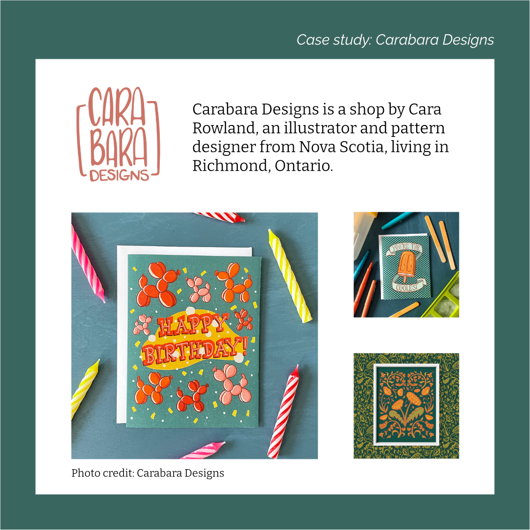
Case study: Carabara Designs
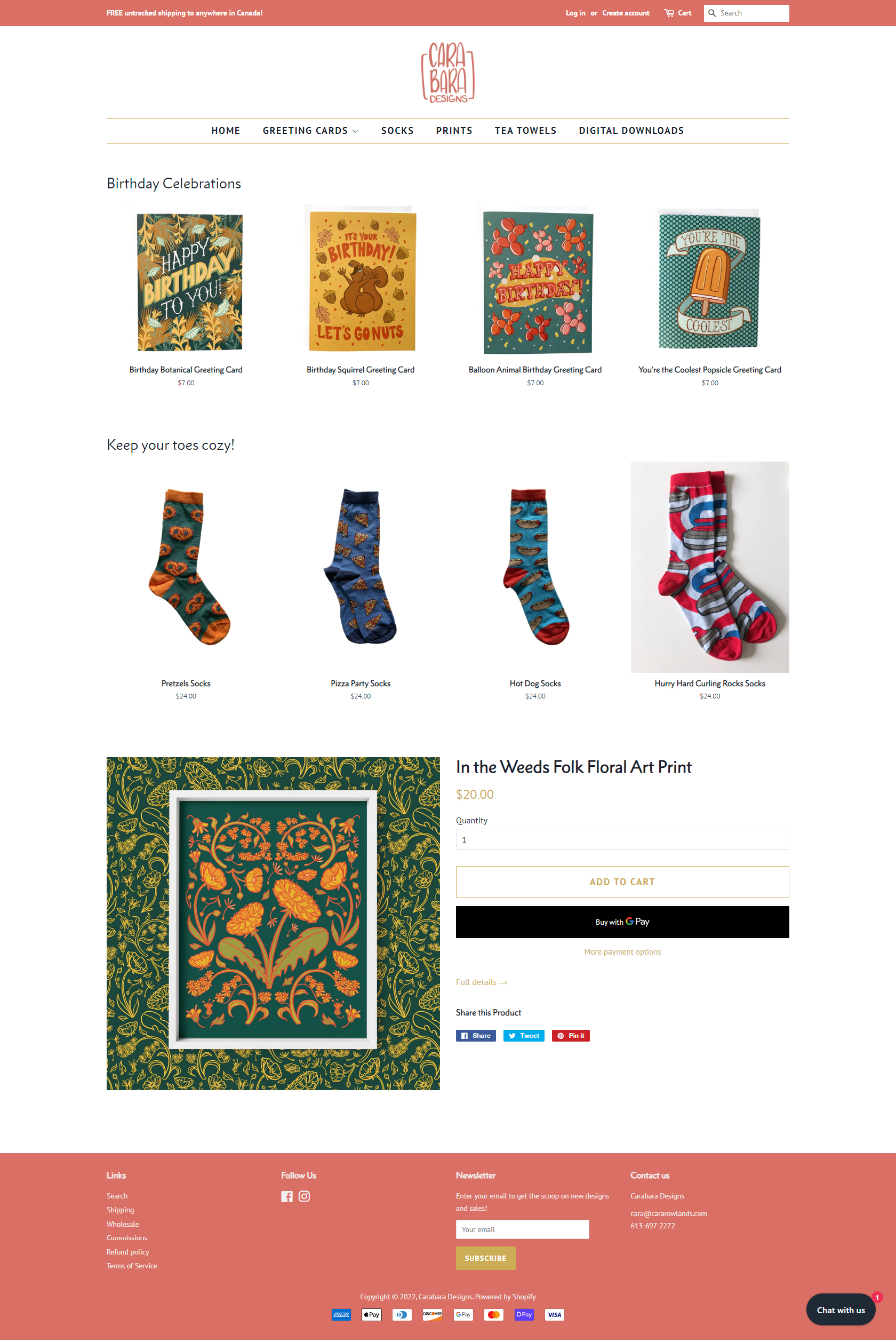
The report cited above by Nielsen Norman Group has several guidelines on what makes a good homepage. I will highlight them by examining a Canadian stationery shop called Carabara Designs . Carabara Designs is a shop by Cara Rowland, an illustrator and pattern designer from Nova Scotia, living in Richmond, Ontario.
Communicate what is sold
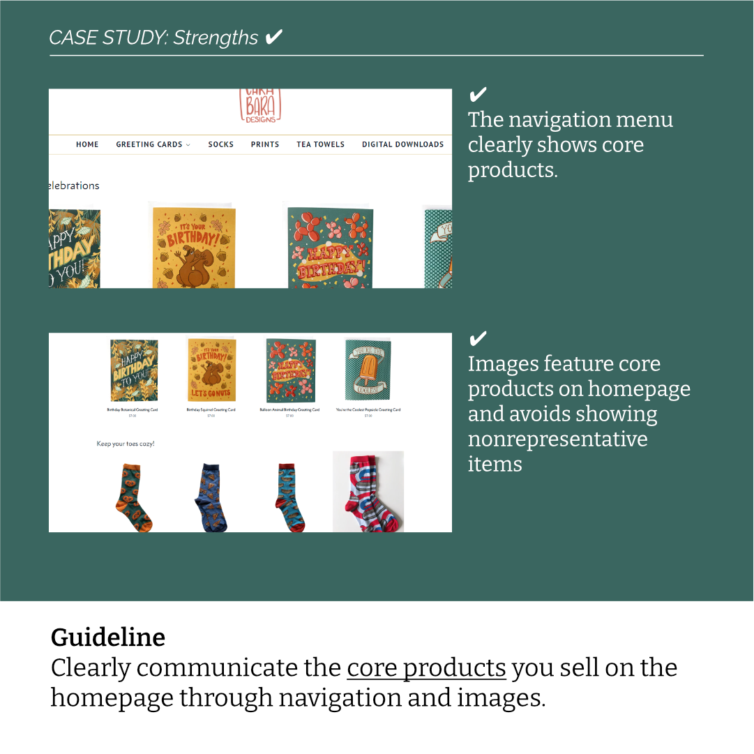
Clearly communicate the core products you sell on the homepage through navigation and images.
Site featured: Carabara Designs
Clearly communicate the core products you sell on the homepage through the menu navigation and product images. This might sound obvious, but there are times when shops introduce new products and give less attention to their core products.
Carabara Designs does this well with a clear menu of products customers could buy and images showing greeting cards and socks.
Use high-resolution media
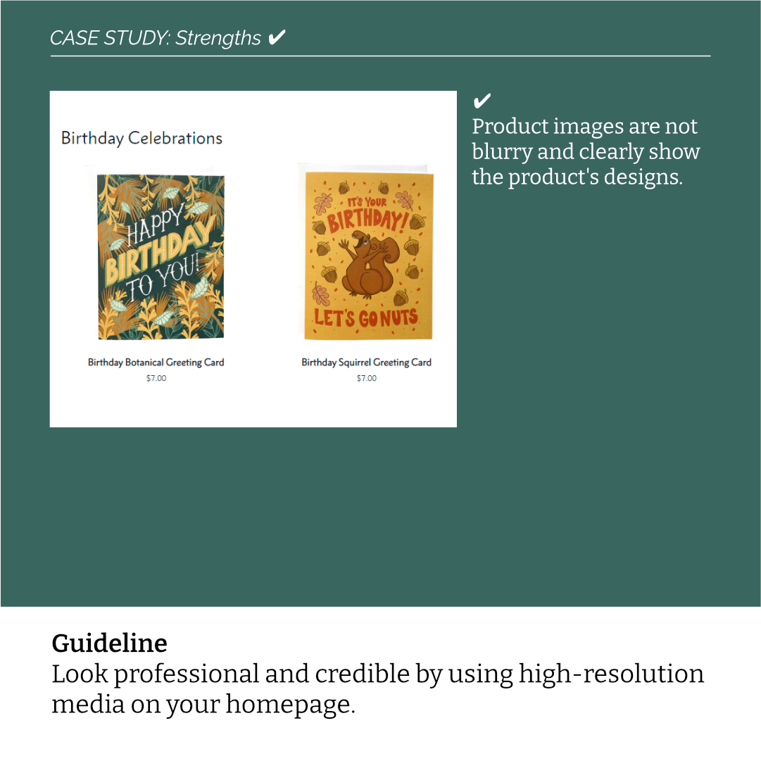
Look professional and credible by using high-resolution media on your homepage.
Site featured: Carabara Designs
Using high quality images is the best way to leave a good first impression on customers, and it’s one of the most recommended ways to improve a shop’s appearance. I’ve seen a lot of feedback in Facebook communities suggesting shop owners to improve the product photos. Spend some time to learn about lighting and staging. Here is a 10-minute video explaining how to take product photography with a smartphone.
I really appreciate the photos by Carabara Designs for these cards, it’s clear to me they did not use mock-up templates and took these themselves. You can tell it has a natural lighting to it and each product has their own unique background.
Use predictable URLs
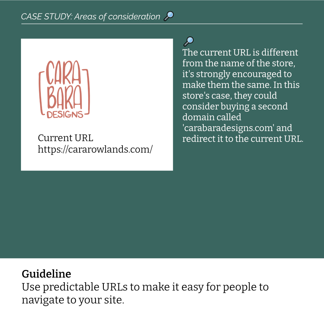
Use predictable URLs to make it easy for people to navigate to your site.
Site featured: Carabara Designs
When you visit a physical store, the only way to get there is to be there physically. For online stores, the most direct way to visit is through a URL. A URL is a portal that can transport you from one place to another in a matter of seconds. Customers either find the URL by searching them up on Google or your Instagram page, or they type them directly into the address bar. It becomes crucial that you make it easy for customers to remember your website’s URL.
In an ideal world, the URLs would be the same as the store’s name. If your name is Hanna Minh Designs, then the URL customers may expect to be hannahminhdesigns.com. Sometimes, customers misspell the URL so it would be a good idea to buy additional URLs that redirect to your main one. In our example, it could be hannahminhdesign.com (without the ‘s’ at the end). Creating more options for customers to access your store provides them a better experience.
The current URL for Carabara Designs is https://cararowlands.com/, which can be confusing to people. If someone purchases from Carabara Designs, and they want to make another purchase, they will probably type in the address bar carabaradesigns.com. A consideration the shop owner can make is to purchase an additional domain called carabaradesigns.com and redirect it to the current URL. If you use Shopify, here is how you can redirect additional URLs .
Communicate brand values
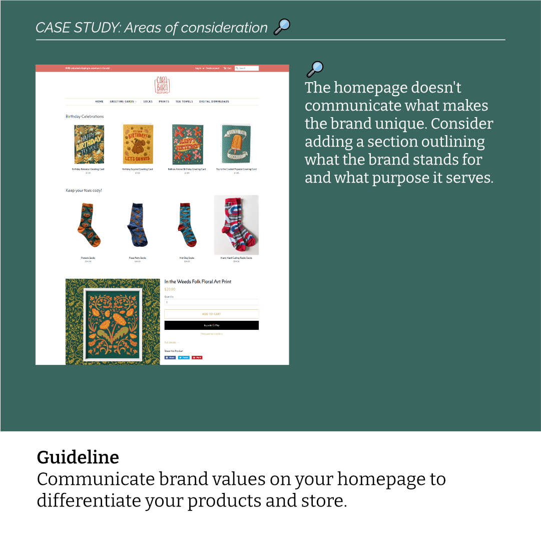
Communicate brand values on your homepage to differentiate your products and store.
Site featured: Carabara Designs
If a store’s purpose is to just sell products, then it’d be no different than selling on Amazon. The prices are low and people only want a good deal. But, if the goal of the store is to offer something more than just products, then it has to be communicated to justify the price difference of products sold on Amazon.
If you sell handmade products, you have to sell the story behind them. This is especially true for small businesses, where you have to consider your talent, time, and labour that goes into your pieces. When you sell something handmade, you are selling quality and creativity that cannot be found elsewhere. Communicate what that creativity conveys and what you hope it can help achieve in the world. A common brand proposition I see in stationery is ‘bringing joy’.
The homepage is your storefront
The homepage is similar to a physical store’s storefront. There is limited space and time to communicate to customers what they can buy and what the brand stands for. Think about how you can in a short amount of time make this very clear to them so they continue to browse your store.
Don’t forget to always consider new visitors to your site. Just because you’ve owned a store for several years, don’t assume people will know what you offer when they visit the first time. Always consider first-time visitors and focus on your core products.
Sources
Most of the guidelines presented in this blog references the Ecommerce User Experience Vol. 2: Homepages, Navigation, and Product Comparisons, 5th edition report, written by the Nielsen Norman Group. This is a comprehensive report with 1073 design guidelines based on over 20 years of usability research.
Comments