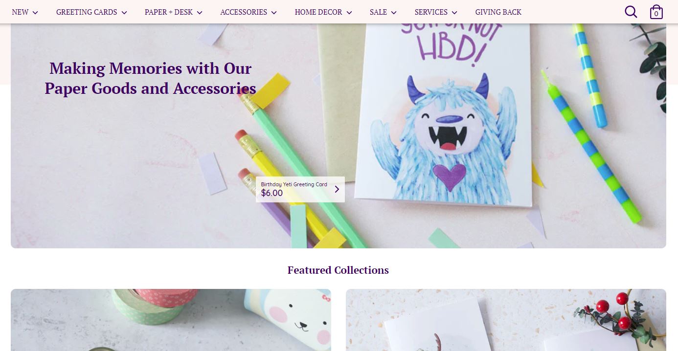
As I sat down to write this post, I initially thought of the website navigation as a wayfinding system, similar to signage you might find in public transportation. I thought web navigation simply directed you to a destination i.e. a webpage. But, after putting more thought into this, I now see website navigation as a table of contents, rather than a wayfinding system. When I browse through books to determine if I want to read it, I usually skim through the table of contents to learn if the book will offer me anything valuable, and if it's worth my time to read. The table of contents organizes the contents of the book into hierarchical categories so it's easier to understand all the information at a high level. A website navigation is similar in that it quickly tells the user what the site offers. It also should be simple enough to navigate so that users can find what they need.
Ecommerce site navigation have two jobs:
-
Introduce new customers to the products the site sells: When I land on a new website, my first goal is to decide if this site is for me. Does it offer anything I want? To determine that, I browse through the navigation.
-
Help users find what they need by classifying and organizing the products: It can be challenging to decide how to categorize your products, which is why this requires a bit more thought and research so it’s done right. If categories are not easily understandable by customers, it can lead to a frustrating user experience.
The guidelines listed in this post are sourced from the 5th edition of the Ecommerce User Experience report series consisting of 13 reports with 1073 design guidelines based on 20 years of research. These reports were published by the Nielsen Norman Group, a UX research and consulting firm trusted by leading organizations world-wide to provide reliable guidance on user experience.


Sign up to our newsletter Beyond Products that goes deep into e-commerce for creative entrepreneurs.
Subscribe NowSave customer’s time by getting to the point
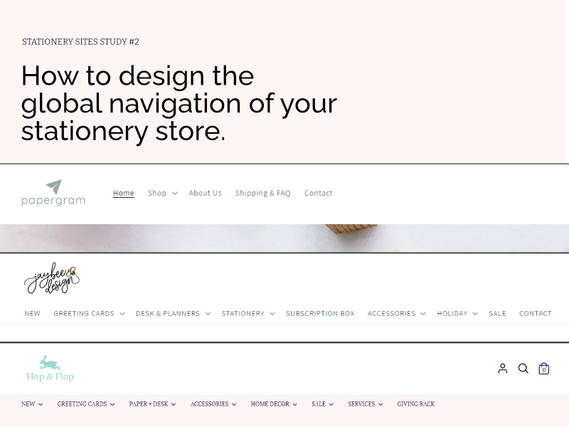
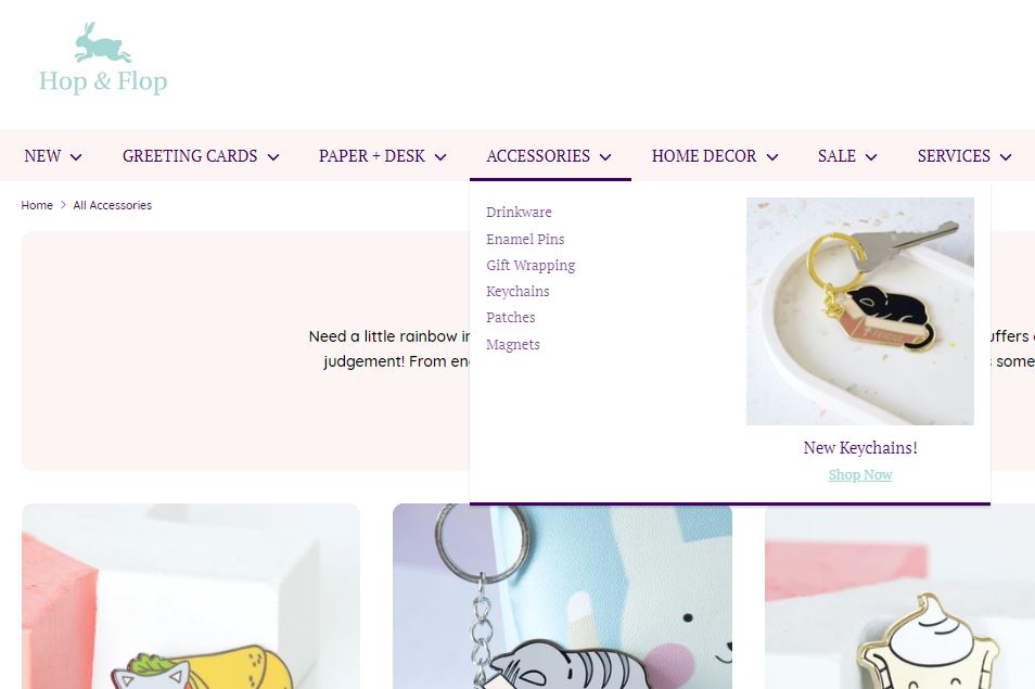
Avoid defaulting to putting products only under a ‘shop’ option in the global navigation. Instead, display product categories directly in the global navigation so customers can quickly learn what the site sells.
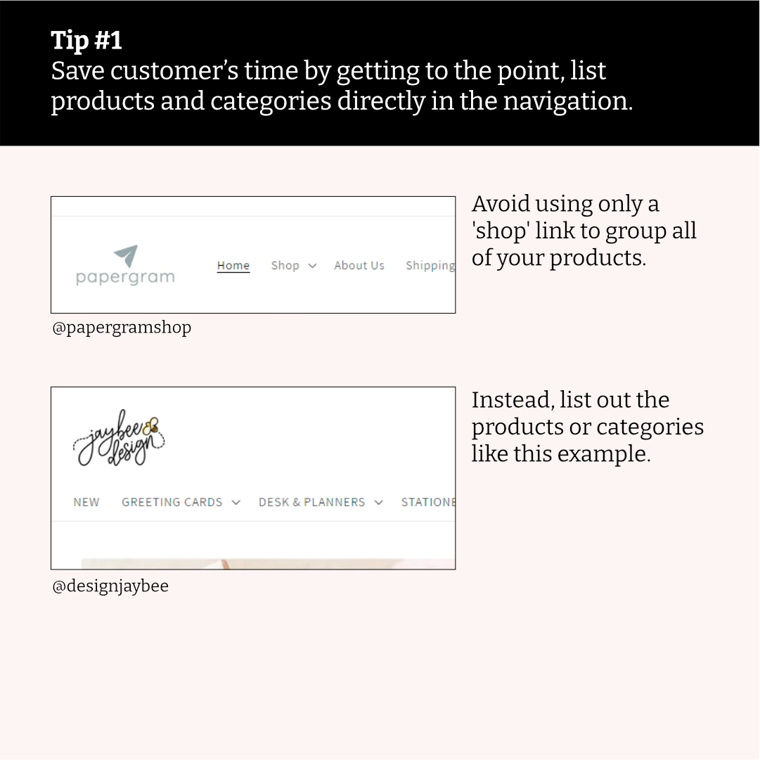
If you sell less than 10 products, consider adding the product directly on the navigation and skip categorizing them (e.g. you sell calligraphy DIY kits, you can put “calligraphy DIY kit” directly in the global navigation). If you have more than 10 products, consider how you would categorize the products and put them on the global navigation.
Try to use categories that the customer would understand, don't assume they understand your industry. A way to ensure customers understand your menu is considering their mental models. You can do an exercise called a card sort, where you ask people to organize a list of items into groups. By watching how they group them, you can better understand their way of thinking. For example, you might think stickers fall into the 'accessories' category, but for some people perhaps it belongs in the 'planning' category.
Cited from the Ecommerce User Experience 5th ed, Vol 2 by Kate Moran, published by Norman Nielsen Group.
- Guideline #13: Use global navigation to show users which product categories are available
- Guideline #17: On sites with limited inventory, consider listing individual items in local navigation
- Guideline #26: For very small product lines, consider using little or no classification
Help visitors orient themselves quickly and easily
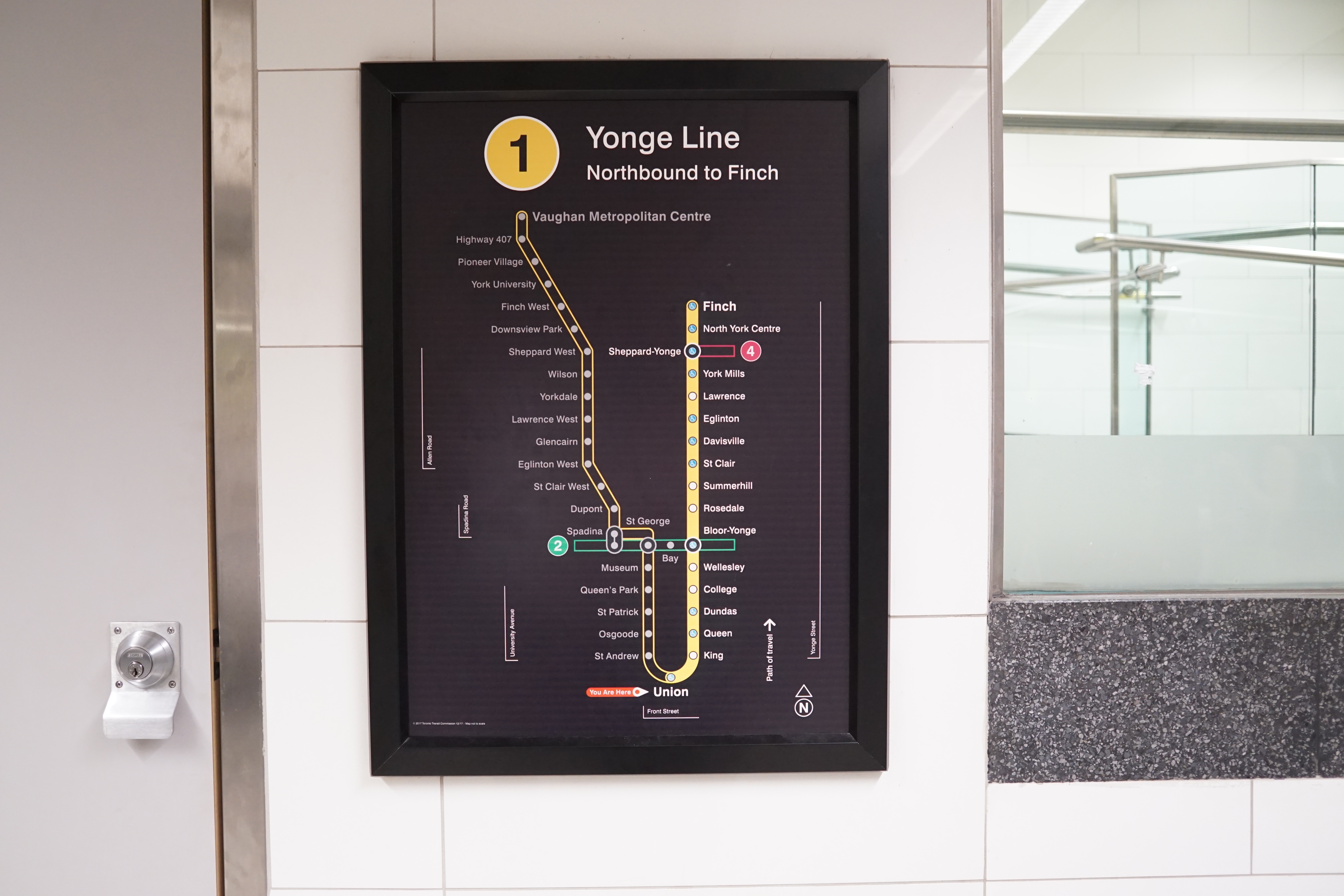
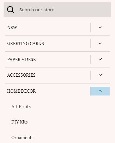
In the Toronto subway system, there are maps throughout the station to help passengers know where they are relative to the entire transit system. Web design offers something similar by highlighting the current page in the global navigations. It’s a simple way to help people who may have entered your site through social media or a search engine and need some help figuring out which page they landed on.
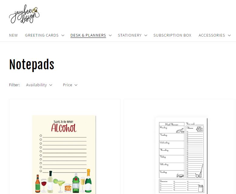
On Jaybee Design website, the current navigation menu item is underlined when you're in that section. Here, 'Desk & Planners' are underlined when we are viewing notepads.
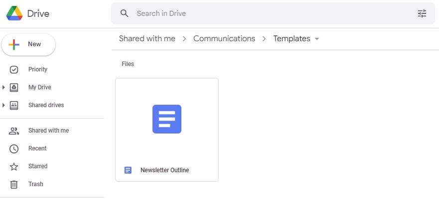
A nice bonus to have are breadcrumbs (referencing the story of Hansel and Gretel where they drop a trail of breadcrumbs to find their way back home), which are a secondary navigation system to help people understand the current page they’re on relative to a higher level page. For example, your current page is “birthday cards”, which could be under the higher level page “cards”. If you ever used Google Drive, you would know how helpful it is to have breadcrumbs and see how files are organized.
Another way to quickly help customers find their way around your store is using a sticky navigation. This means that when you scroll down the page, the global navigation is always visible.
Cited from the Ecommerce User Experience 5th ed, Vol 2 by Kate Moran, published by Norman Nielsen Group.
- Guideline 21: Consider providing a sticky navigation bar
- Guideline 25: Show the user’s current location in the site
- Guideline 39: Provide breadcrumb trails to help orient users and give them access to parent categories
The overlooked footer that does the heavy lifting
The footer is often overlooked when building websites, yet it is the place people look to when they need additional information they can’t find in the header. The footer is the place to establish authority, credibility, and trust.
According to Ecommerce User Experience report, the bare minimum the footer should include are:
Company information This could link to an ‘about’ page, or you could be more direct and put a short paragraph explaining the brand [example]
Shipping and return policies This is crucial and shouldn’t be skimped over. Be very clear where you ship to and how long shipping might take. It helps to clarify if there are import duties if you ship internationally. Return policies can give shoppers an added layer of reassurance due to the nature of ecommerce, which is they cannot physically test or see products. Specify if returns are allowed and under what conditions (e.g. package never opened, buyer pays for return shipping etc.). Good place to highlight if you offer free shipping or returns. Also very popular to highlight free shipping if available at the announcement bar at the top.
Customer support This will vary widely by products you sell. Generally, it’s the place you could share commonly asked questions. If your products are more complex and you need to provide more education on how your products should be cared for or used, you can add details here as well. Hours online, time zone.
Contact information In general, it’s common practice to share contact information directly in the footer, whether it’s an e-mail or a toll free number. Consider if you want to be very accessible and the volume of inquiries you get on a weekly basis. If you are a one-person shop and don’t have the time to answer all inquiries, consider putting a FAQs page in the footer, and embed contact details there if customers need additional support. It's also common practice to list links to social media in this section.
Privacy policy and terms of use A privacy policy is a document that outlines how an organization collects, manages, stores, and uses data collected from its customers/clients. There are many policies throughout the world that require organizations to legally have a privacy policy in place. For example, Canada has the Personal Information Protection and Electronic Documents Act (PIPEDA), which “sets out the ground rules for how businesses must handle personal information in the course of commercial activities.” (Source). Europe has the General Data Protection Regulation (GDPR), which determines how businesses should handle customer’s data. GDPR protects the users, so even if you’re based outside of Europe, GDPR still applies if the user is from Europe. Businesses that fail to comply with these regulations may be fined a hefty amount. If you use Shopify, they offer a free privacy policy template that is GDPR-compliant.
A Terms of Use document explains "what people can and cannot do on your website or service" ( Source: Termsfeed ). Terms of Use is not legally required, but is highly recommended.
Cited from the Ecommerce User Experience 5th ed, Vol 2 by Kate Moran, published by Norman Nielsen Group.
- Guideline #34: Provide footer links to customer service, contact information, shipping policies, return policies, and company background information
- Guideline #35: If your site offers free shipping and returns, highlight that fact clearly in the footer
- Guideline #36: Use clear subheadings and chunking to organize your site’s footer
Optimize your site menu navigation system
Take a look at Amazon, what do you see at the top? From a very quick glance, you’ll see a prominent search bar at the centre, the Amazon logo on the left, and the shopping cart on the right. These three elements have become something customers will expect online stores to have. Consider including these in the global navigation of your store.

A popular addition to the global navigation is ‘Bestsellers’, which will show customers what is well received by previous customers. It’s a very good starting point for new customers who don’t want to sift through your entire catalogue and are looking for something quick to purchase.
Where possible, add photos directly in the navigation. This adds a visual element to your menu than just a collection of text.
For mobile, use a sequential menu so customers can easily see how your products are organized and they can easily go between different categories.
Cited from the Ecommerce User Experience 5th ed, Vol 2 by Kate Moran, published by Norman Nielsen Group.
- Guideline #15: Include search, an account sign-in link, and a cart link in the global navigation
- Guideline #23: For very visual products, consider including photos in the site navigation
- Guideline #32: Offer a Bestsellers category
Comments